30sec WordPress Services Case Study:
Everything Wrong With all MODERN websites
12 fails with examples + analysis + tips on HOW TO SOLVE THEM
Mocking modern times online's presence and current digital trends is not extremely difficult, considering the sheer number of existing websites. Even if we're talking about more than 1.8 billion websites, but whos counting. Also, most of those websites get almost no visitors and are inactive sites (those that do not get regular changes). But, those websites up-to-date with the latest changes, trends, style and mandatory compliances are plagued with issues, that kills any savvy internet navigator!
Daryl Ginn (@darylginn - https://twitter.com/darylginn made a short video (less, that 30 seconds), showcasing common problems that ALMOST ALL websites have in 2018. Let's watch this masterpiece, that presents 12 common issues and it has already 787K views within a few days and 38K likes / 20K people are talking about this:
Every website in 2018 pic.twitter.com/Gm7jhfuuUO
— Daryl Ginn (@darylginn) October 20, 2018
Care for your WordPress: Delegate technical work to us. Enjoy a headache-free WP!
Issue 1 - Unnecessary branding
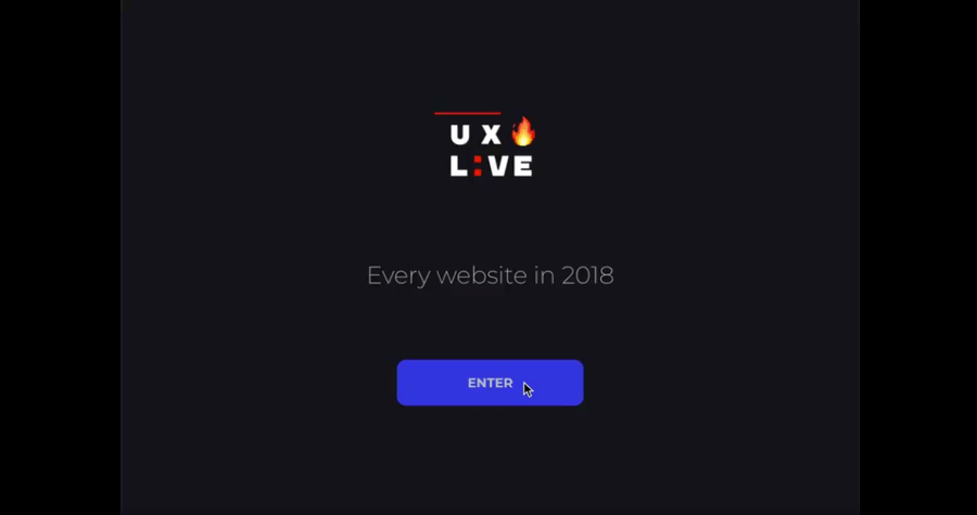
ANALYSIS: Unnecessary branding
Reaching a website just to see a logo, that you barely can make out, with a slogan, that makes no sense is just a reason to smile, and politely click on the single option you have. It's more like a personal ego boost for the owner, rather than a speed or usability feature, no matter how they wrap it.
HOW TO SOLVE: Unnecessary branding
If you have a global site: stop assuming we're wrong. If we arrived at "that" domain, it means we were guided there (by some link or our amazing memory), just to politely being told, we're at the wrong place. Put those country/language flags in header/footer and stop the forced herding. Solve your cart issues for international orders. Allow us to select language and currency.
For everybody else: annoying ALL YOUR VISITORS just to solve a few corner cases of navigation is wrong. Focus on channelling your visitors in less than two clicks to your main business pages.
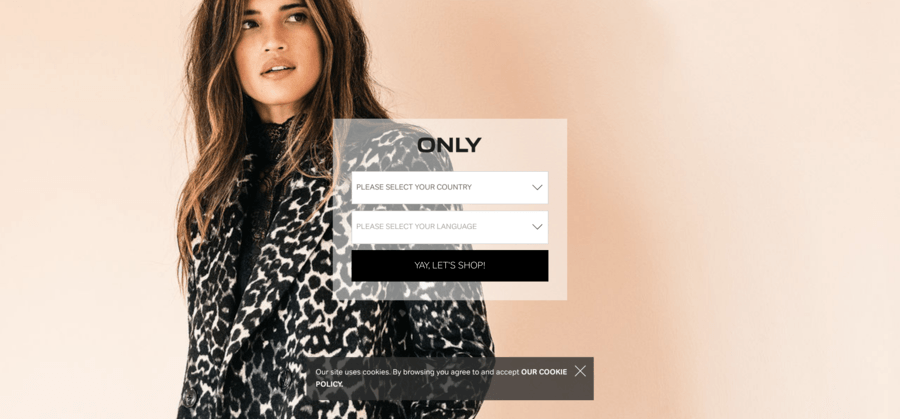
Real life example: the hompeage of https://www.only.com/
Issue 2 - Browser Notifications
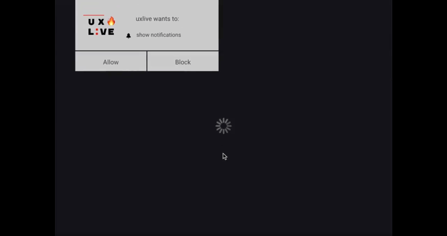
ANALYSIS: Browser Notifications
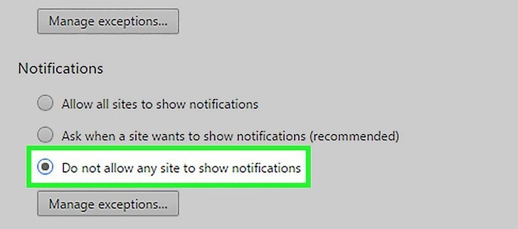
Browser Notifications for public websites are mostly displayed on the 1st-page load (does not matter which page). They are extremely intrusive, blocking any normal interaction to continue or attempt to ignore them. Seldom break mobile navigation experience.
HOW TO SOLVE: Browser Notifications
Decide what is your main communication objective: connect with your visitors via email or social media or browser notification (or whatever). Then push the top priority focus, and be less pushy about alternatives. Optionally, just put all your communication options right next to each other, and allow your visitor to decide - just a wild thought! :)
Real life example: Most users have their notification to BLOCK: ALL - since 2017 anyways.
CHEAPER & FASTER: Compared to designers + developers + sysadmins hired for specific WordPress tasks.
Issue 3 - Homepage change
ANALYSIS: Homepage change
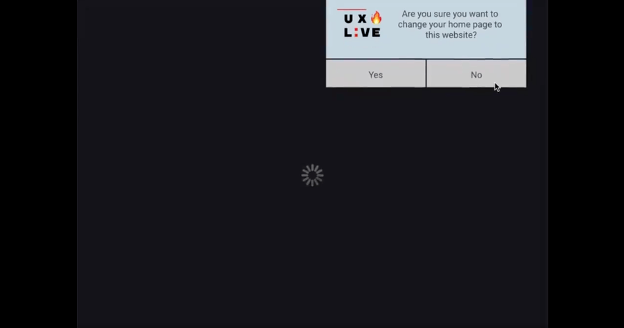
Another full STOP, blocking advancement to whatever you wanted to do. The amount of self-righteousness to even ask a question like this is absurd.
HOW TO SOLVE: Homepage change
Sell your online business and start doing something else, rather than waste everybody's time. Optionally, maybe you should focus on creating a motive for everybody to visit your site daily. Then, we can all consider a bookmark - but that is as far as we go.
Issue 4 - Privacy policy
ANALYSIS: Privacy policy
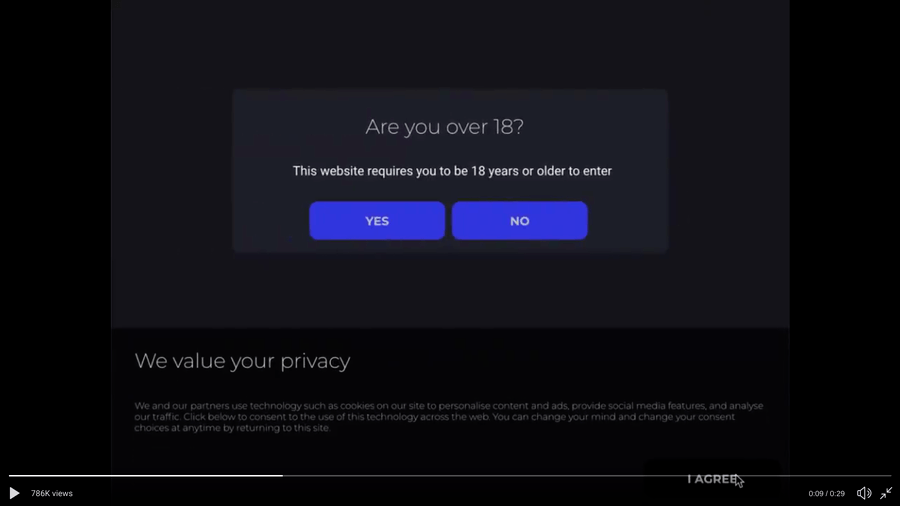
GDPR compliance is not a laughing matter. You must comply. However, there is no written law, that you need to be pushy. Just because everybody is doing it, it does not matter you should do it exactly like that also.
HOW TO SOLVE: Privacy policy
Tie together your GDPR compliance notifications and user interaction requests. Try not to put them on the first page opened, since, that one was already visited. Avoid blocking a significant portion of your webpage. Most importantly make sure no TWO DIFFERENT CTA's are visible on the same "visible area" from your page.
Issue 5 - Validation avalanche
ANALYSIS: Validation avalanche
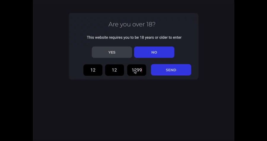
This is the "Are you sure?" equivalent of everything. Reinforcing an already provided user interaction, just to provide nothing nor receive anything. Simple time wasters, resource hogs and patience enforcers.
HOW TO SOLVE: Validation avalanche
Mostly remove them: Asking the same questions over and over is counterproductive. Nobody likes them, nobody is fooled, yet everybody is annoyed.
Sometimes is useful: like on double-opt-in lists for the second, aka special subscriptions. Or when destructive actions are followed, like profile/order deletion/change/modification.
VERY AFFORDABLE FOR ALL THAT IT OFFERS! CHEAPER and FASTER, than designers + developers + sysadmins hired for specific WordPress tasks.
Issue 6 - Location detection

ANALYSIS: Location detection
This is a serious privacy breach. Always more intrusive, when your physical location is tracked. And when that tracking data is stored on obscure and shared with everybody service providers, then all hope should be abandoned.
HOW TO SOLVE: Location detection
STOP DOING IT! There is no reason, why you should track location for your online visitors. You have your analytics already doing that, use that data for whatever you need. Pilling up technologies, that identify and track visitors, even after they leave your website is just plain wrong, or pure evil - if you're doing this willingly.
Issue 7 - Subscribe pop-up

ANALYSIS: Subscribe pop-up
Subscribe pop-up boxes, nicely designed, with eye-catching visual elements. For newsletters, special deals, inside information. Nothing wrong with them, just most implementation tactics lack finesse.
HOW TO SOLVE: Subscribe pop-up
Avoid pop-ups: Traditional pop-ups are blocked by default. For mobile visitors, an intrusive pop-up is a dead end. Are you sure you want to block your visitors with your first pop-up? Off course not. Are you sure you want the second, third, fourth and fifth pop-up on every page? Off course not. If yes, then there is a special place for people like you!
Do it correctly: Put a timer on your pop-up, and wait at least 2-3 minutes. If a visitor is not sure, he/she is on the correct path to solve the challenge their facing, a subscribe pop-up would not solve anything but, the opposite. If they are sold already by your content, then a subscribe request is welcomed. Mostly, conversion is higher on the 2nd or on the 3rd-page visit for these subscribe boxes. Even better, when these pesky pop-ups are eliminated. Just put your subscribe box to the footer or widget area. This way is always visible, not just a single time when it can be blocked.
Issue 8 - Chat pop-up

ANALYSIS: Chat pop-up
Homepage content still loads, displaying empty space, yet somebody from their support/sales department already says "hello AND welcome AND today's specials AND a nice unique selling point for enterprise users". AND when you actually try to get in contact....you just wait for minutes, to actually be connected to THAT person.
HOW TO SOLVE: Chat pop-up
Avoid Chat pop-ups! Keep it visible and non-intrusive. Make sure they work on mobile platforms (phone, tablets). Most of the solutions lack responsive features, crashing entire browsers, and devices. Also, make sure waiting time for the queue is a decent one. If you don't understand why, then imagine this: somebody knocks on your door, and when you answer it, the person is on its phone making you a sign to wait, till it finishes the undergoing conversation. How much would you wait patiently, till it is over?
Care for your WordPress: Delegate technical work to us. Enjoy a headache-free WP!
Issue 9 - AD blocking detection
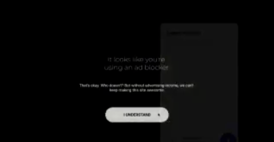
ANALYSIS: AD blocking detection
This is the modern era's attention extortion for a lousy penny. Not even trying to explain why would somebody think this is ok. If you consider, that your business cannot survive without enforcing ads, then, please close your business. You're blocking a valuable spot in your business niche, for some modern thinking.
HOW TO SOLVE: AD blocking detection
STOP DOING IT! You already know, that a normal visitor is already blocking your ads. That's why you added this technology, yet numbers and statistics prove you wrong. It does not work. Visitors have more and more choices, abandoning your website is just one click away.
Do it correctly: Put non-intrusive ads and just a few. The pushier it is, the more it gets ignored. You cannot force it, but we can block it. Your call.
Issue 10 - Exit page intents

ANALYSIS: Exit page intents
Another good example of condescendence and unfounded evilness with a huge pile of undeserved annoyance. These type of pop-ups appear after 15-20 seconds of inactivity or tab change detection or close intent.
HOW TO SOLVE: Exit page intents
STOP DOING IT! There is a reason, why that specific tab IS already abandoned. Annoying with yet another useless question just makes the close button even more charming.
Do it correctly: Detect relevant corner cases and provide managed help. Like: after 3-4 searches in knowledge base provide customer support option. Or after unsuccessful cart checkout, provide a genuine real human follow-up. Avoid emphasis on the problem, visitor already knows something went wrong, you already detected, that something went wrong - asking open-ended questions makes matter even more difficult.
Issue 11 - Server-side crashes

ANALYSIS: Server-side crashes
These are the most baffling events one can encounter on a webpage. There is no warning, no error, no hint. Just a plain server-side crash. Good luck with what you were doing, you must start all over everything.
HOW TO SOLVE: Server-side crashes
Recurrent WordPress Services prevent these types of problems. During the maintenance period, logs are checked for these type of errors. On a pro-active approach, these type of errors are caught and analysed as they happen, so they can be solved faster. Especially to avoid an outage for everybody.
Issue 12 - Social exit intent

ANALYSIS: Social exit intent
Less annoying, than an Exit page intent, but similar as technology. Just the approach is different. Bribing for some social media interactions, promising a quick fix for your challenges.
HOW TO SOLVE: Social exit intent
STOP DOING IT! There is a reason, why that specific tab IS already abandoned. Annoying with yet another useless beg for some social media love just makes the close button even more charming.
CHEAPER & FASTER: Compared to designers + developers + sysadmins hired for specific WordPress tasks.
We’re passionate about helping you grow and make your impact
Continue being informed
Monthly vulnerability reports about WordPress and WooCommerce, plugins, themes.
Weekly inspiration, news and occasional with hand-picked deals. Unsubscribe anytime.


